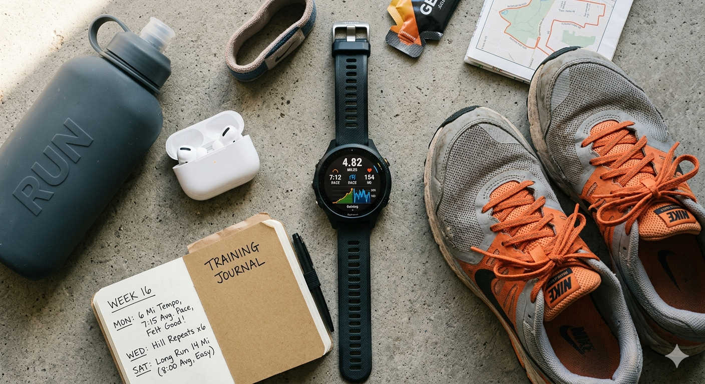
Picture this: you finish a solid 8-mile run, sync your watch to Strava, and spend about twelve seconds looking at it. Distance — check. Pace — decent. You double-tap a couple of kudos notifications and close the app. Sound familiar?
If so, you’re not alone — and you’re also not getting close to the full value Strava can offer you as a runner. Beneath those headline numbers is a surprisingly rich layer of training insight that most people scroll past without a second thought. Heart rate trends, effort scores, fatigue curves, grade-corrected paces — all of it is sitting there, waiting to be read.
The good news is that understanding your Strava data doesn’t require a sports science degree or hours of number-crunching. It just takes knowing what each metric actually means and why it matters for your specific training. That’s exactly what this guide covers — from the first things you see after a run all the way to the subscriber-level features that can genuinely change how you train and race.
What the Activity Page Is Really Telling You
The activity page is where most Strava analysis begins and ends for the average runner. But spend a few extra minutes on it after your next run and you’ll find it has a lot more to say than just how far and how fast you went.
Moving Time vs. Elapsed Time — Why the Difference Matters
At a glance these two time values can look nearly identical, but they tell very different stories. Elapsed time captures everything from the moment you started your watch to the moment you stopped it — traffic lights, shoe retying, catching your breath at the top of a hill. Moving time strips all of that out and shows only the duration you were actually in motion.
For everyday easy runs this gap is usually negligible. But if you do structured interval sessions with built-in recovery periods, or if you run in a city where stopping and starting is unavoidable, relying on elapsed time to judge your average pace will give you a misleadingly slow number. Moving time is the fairer benchmark for workout-to-workout comparisons.
Elevation Gain — Context for Your Effort
Two runners log a 10-mile run at exactly the same average pace. One ran along a flat canal path. The other tackled rolling countryside with 900 feet of climbing. Those are not the same workout — not even close — but the pace figure alone won’t tell you that.
Elevation gain gives you the context you need. It won’t tell you the precise physiological cost of those climbs, but it immediately explains why a run that felt brutally hard produced a pace that looks unremarkable. Pair elevation data with Grade Adjusted Pace (covered in detail below) and you’ll have a much sharper picture of what any given run actually demanded from your body.
Heart Rate Data — A Window Into Your Aerobic Fitness
Your heart is arguably the most honest performance indicator you have. It doesn’t care about ego or what the training plan says — it reflects exactly how much your body is working in any given moment.
If you train with a chest strap, an optical wrist sensor, or a GPS watch with built-in heart rate monitoring, Strava logs your average and peak heart rate for every run. The most valuable thing you can do with that data is watch it over time rather than in isolation. Take a regular training loop you run weekly. If after two months of consistent training your average heart rate on that same loop has dropped by four or five beats while your pace stays the same, your aerobic system has genuinely improved. Your heart is doing the same job with less effort. That downward drift in heart rate at a fixed pace is one of the clearest signals of aerobic progress you can track.
The flip side is also informative. If your heart rate on an easy run is suddenly running 10 to 15 beats higher than normal for no obvious reason — and you haven’t changed your pace — that’s worth paying attention to. Accumulated fatigue, dehydration, early illness, or poor sleep can all push heart rate up before other symptoms appear.
Cadence — The Running Form Metric Nobody Talks About Enough
Cadence measures how many steps per minute you take while running. It’s one of those metrics that feels invisible until you start tracking it, at which point it becomes fascinating.
Most coaches and biomechanics researchers point to a range of roughly 170 to 180 steps per minute as an efficient target for distance runners, though what’s right for you depends on your height, leg length, fitness level, and running speed. There’s no universal magic number. What matters more is understanding your own baseline and noticing when it shifts.
Very low cadence — consistently below 160 spm — often correlates with overstriding. That’s the habit of reaching your foot out too far in front of your body with each step, which creates a braking effect and increases impact forces on your joints. Over time, that pattern is associated with a higher injury risk. Watching cadence in Strava won’t fix your form on its own, but it can alert you to a pattern worth investigating with a coach or physio.
Grade Adjusted Pace — The Fairest Measure of Running Effort
If you run on hilly routes, trails, or any terrain that isn’t billiard-table flat, Grade Adjusted Pace (GAP) may be the single most practically useful Strava metric available to you.
Here’s the problem it solves. Raw pace — minutes per mile or per kilometer — is a fair comparison tool only on similar terrain. When you add hills, a slower pace doesn’t necessarily mean an easier run. A runner grinding up a steep incline at 10:30 per mile could be working just as hard as someone blazing a flat road at 7:30. Raw pace hides that reality.
GAP accounts for the gradient of every section of your run and translates your actual pace into what it would have been on flat ground. If you ran uphill at 10:30 per mile but the grade-adjusted figure reads 8:15, Strava is telling you that the physiological effort of that uphill stretch was equivalent to running 8:15 on level terrain. Suddenly that “slow” run looks a lot more impressive.
This matters most when you’re trying to compare your effort across different routes and different days. If your training goal on Thursday was to run at a moderate aerobic effort, GAP tells you whether you hit that target — even if the terrain made the raw pace number look nothing like what you expected.
Find GAP in your activity’s split data on both the app and the Strava website. For trail runners, it’s practically indispensable.
Understanding Relative Effort — Strava’s Training Load Score
Every run asks something of your body. But not all runs ask the same thing, and distance alone is a poor way to compare them. A 12-mile easy long run and a 5-mile race-pace tempo effort are wildly different physiological experiences. Relative Effort is Strava’s attempt to put a single number on how much cardiovascular stress each run actually produced.
The calculation is rooted in heart rate. Strava looks at how much time you spent in each heart rate zone during your run and weights those zones accordingly. Time spent at low intensity contributes a small amount; time spent pushing hard in zone 4 or 5 contributes far more. The result is a score that gives you a meaningful cross-run comparison — something distance and pace simply can’t do.
An easy 30-minute jog might produce a Relative Effort score in the 30s. A genuinely hard 10K effort could push past 150. The exact numbers aren’t as important as the relative comparison between your own runs over time.
The practical value becomes clearest when you look at weekly totals. If your body is feeling beaten up but your mileage hasn’t changed much, your Relative Effort total might reveal that the intensity of those miles has crept up significantly. You weren’t just running more — you were running harder, and the score shows it.
One thing to get right before you trust this metric: your maximum heart rate setting in Strava. Heart rate zones are calculated as percentages of your max HR. If that baseline number is off, your zones are off, and your Relative Effort scores become unreliable. Head to your profile settings, find the Performance section, and enter the most accurate max HR you know. From there, Relative Effort earns its place as a genuinely useful training tool.
Pace Zones and Heart Rate Zones — Are You Training at the Right Intensities?
One of the most common mistakes recreational runners make isn’t running too little — it’s running too much at the wrong intensities. Most people drift toward a comfortable middle gear: not quite easy, not quite hard. It feels productive, but it captures neither the aerobic benefits of true easy running nor the performance adaptations that come from genuinely high-intensity work.
Strava’s pace and heart rate zone breakdowns, available to subscribers, give you a post-run breakdown of exactly which zones you spent your time in. After an easy run, you should see the vast majority of your time in zones 1 and 2. If you see a significant chunk in zone 3 or 4 on what was supposed to be a recovery day, the data is flagging a pattern worth correcting.
This connects to a principle that experienced runners and coaches often call polarized training — the idea that most of your running should happen at genuinely comfortable aerobic effort, with a smaller proportion at genuinely high intensity. The murky middle ground between the two, where most amateur runners live, produces fatigue without producing the clearest adaptations.
Setting up zones properly takes five minutes and makes all of this more useful. In the Strava app or on the website, go to Settings, then My Performance. You can enter a recent race result — a 5K or 10K from the past few months works well — and let Strava calculate your pace zones from that. It’s not perfectly precise, but it’s a solid starting point that improves the accuracy of every zone-based metric you’ll see going forward.
The Fitness & Freshness Chart — Your Training Story at a Glance
Most runners who pay for Strava never open this feature. That’s a shame, because once you understand what it’s showing you, it becomes one of the most valuable planning tools in your entire training toolkit.
Fitness & Freshness, accessible from the Training menu on the Strava website, displays three lines on a single chart: your Fitness score, your Fatigue score, and your Form score. They’re calculated from a mathematical model originally developed by exercise physiologist Dr. Eric Banister in the 1970s, which describes how the body adapts to training stress over time.
Fitness represents your long-term accumulated training load. It’s calculated as a rolling average weighted over roughly the past six weeks, which means it rises gradually as you build consistent training volume and intensity — and it falls gradually when you reduce load. It doesn’t spike after one hard week or crash after one easy week. It’s a slow-moving, patient number that reflects genuine fitness accumulation.
Fatigue is the shorter-term counterpart. It’s weighted over the past week or so, which means it responds quickly to what you’ve been doing recently. A block of hard training pushes it up fast; a few easy days or a rest day pulls it back down almost as quickly. Fatigue captures how tired your body is right now, not how fit it is overall.
Form is the relationship between the two — Fitness minus Fatigue. When your Form score is positive, it means your recent training has been lighter than your long-term fitness level, so you’re relatively fresh. A positive Form score going into a race is generally a good sign. When Form is deeply negative, you’re carrying more accumulated tiredness than your base fitness can comfortably absorb, and performance — and injury risk — often suffers.
The most strategic use of this chart is race preparation. In the weeks before a goal event, watch what happens to these three lines as you taper. Your Fatigue score drops relatively quickly as your training load reduces. Your Fitness score holds steady for a while before beginning to dip. The window where Fatigue has cleared but Fitness hasn’t yet faded is your peak performance window. Many experienced runners aim to arrive at a goal race with a Form score somewhere between +5 and +25.
To toggle on the Fatigue and Form lines (they’re hidden by default), click inside the Fitness & Freshness chart and look for the display options. Give yourself a few weeks of consistent data before reading too much into the numbers — the chart tells a better story over months than over days.
Workout Analysis — Getting More From Structured Sessions
If you do any kind of structured running — intervals, tempo blocks, fartlek sessions, hill repeats — Strava’s Workout Analysis screen adds a layer of review that flat activity summaries simply can’t provide.
It breaks your run into individual laps and shows the key stats for each one: average pace, total distance, time, heart rate, and which pace zone that lap fell into. This lets you review your session with actual precision rather than just an average figure that blends your warm-up, your hard efforts, and your cool-down into a single uninformative number.
The most useful question to ask when reviewing an interval session isn’t “how fast was my fastest rep?” It’s “how consistent was I across all of them?” A runner who hits 6:30, 6:31, 6:28, 6:34, 6:30 across five 800-meter reps has done something meaningful. A runner whose splits read 6:10, 6:15, 6:25, 6:40, 6:55 went out too hard and paid for it. The progression tells the story, and Workout Analysis makes that story readable.
To capture clean lap data, make sure your GPS watch is set to either auto-lap at appropriate distances or that you’re pressing the lap button manually at the start and end of each effort. The quality of your Workout Analysis is directly proportional to how intentionally you split your runs while you’re out there.
Segments — Useful for Progress Tracking, Dangerous for Recovery Runs
Strava segments are fixed stretches of road or trail — often hills, iconic loops, or well-known local landmarks — where every runner is automatically timed and ranked. They’re one of the platform’s most popular features, and they’re genuinely useful for one specific purpose: tracking your own improvement over time on a consistent route.
Repeat a segment across different weeks or months and you have a controlled fitness test built into your regular running. If your time on a local hill climb improves by 30 seconds between January and April, that’s a concrete, comparable result that tells you something real about your fitness trajectory. No lab test required.
The risk is treating every run as an opportunity to chase segment placings. Running hard on a recovery day to take a few seconds off a local leaderboard is a trade-off that rarely ends well, particularly for runners who are already managing fatigue or building up mileage carefully. Segments are useful as benchmarks. They’re less useful as daily competition.
Think of them the way a scientist would use a control variable — something consistent enough to isolate one changing factor (your fitness) over time.
Strava’s AI-Powered Activity Summaries
Strava’s Athlete Intelligence feature uses generative AI to write a short plain-English summary of each activity, drawing on your pace, heart rate zones, elevation data, and Grade Adjusted Pace. You’ll find it just below the stats box on your activity page. Tapping “Say More” expands it into a more detailed breakdown.
It won’t replace the value of learning to read metrics directly, but it’s a genuinely helpful starting point — especially for newer runners who find the raw numbers less intuitive. Think of it as a first-pass translation of what the data is showing, rather than a substitute for understanding the data itself.
Your Training Log — Where Progress Becomes Visible
Individual runs are snapshots. Your training log is the full picture.
The Training Log view in Strava’s web app shows your activity calendar week by week and month by month, with total mileage and effort visible at each level. Spend time with it and patterns emerge that are invisible in any single workout. Maybe your mileage always dips in the third week of a training block before coming back. Maybe your biggest injury last year followed a three-week spike in volume that looked fine at the time but stands out clearly in hindsight.
The Relative Effort trend view, found under Progress in the Strava app, shows how your current week’s total effort score compares to the previous four or five weeks. Gradual increases over time are healthy. Sudden large jumps — particularly a week where effort spikes by 30 to 40 percent with no corresponding build-up — are a warning sign worth heeding. Your body doesn’t adapt well to abrupt load changes, and injury often follows on the heels of them.
Get the Settings Right First — Or None of This Works Well
All of Strava’s analytical features are only as good as the data feeding into them. Before relying on any of the metrics above, spend five minutes making sure these four things are configured correctly.
Maximum Heart Rate. This is the most important setting to get right. It determines your heart rate zones, which in turn determine your Relative Effort scores, which feed into your Fitness and Freshness chart. If your max HR is set to the default formula estimate and your actual max is 10 beats higher or lower, everything downstream is skewed. Use the most accurate number you have — from a recent hard effort, a fitness test, or a discussion with a coach.
Pace Zones. Input a recent race result under Settings > My Performance. Strava will calculate your pace zones from there. Update this every few months as your fitness changes.
Device Syncing. Check that your GPS watch or phone app is syncing every activity reliably. Missed syncs create holes in your Fitness & Freshness chart and distort your trend data. If you’re regularly logging runs without heart rate data, those runs contribute nothing to your Relative Effort scores.
Activity Type Labels. Always distinguish trail runs from road runs when logging. Segments, grade adjustments, and pace comparisons are far more meaningful when you’re comparing like with like.
Third-Party Tools That Extend What Strava Offers
Strava is an excellent starting point, but it isn’t the most analytically deep platform available. For runners who want to go further, a handful of third-party tools connect directly to your Strava data and provide additional layers of analysis.
Runalyze is particularly well-regarded among data-oriented runners. It offers more detailed physiological estimates — including VO2 max modeling and recovery time predictions — and a more granular training load system than Strava provides.
Intervals.icu provides a free and highly detailed Fitness & Freshness equivalent that uses Training Stress Score rather than Relative Effort, giving it slightly more precision for runners who also cycle or use a power meter. Its interface is more technical than Strava’s, but the depth is considerable.
VeloViewer connects to Strava and offers enhanced visualization and goal-tracking features that the native platform doesn’t include.
None of these tools replace understanding your Strava data — they extend it. Master the basics on Strava first, and you’ll get much more out of any third-party platform you add later.
A Simple Review Habit That Takes Five Minutes a Week
The runners who extract the most value from training data aren’t necessarily the most analytical people. They’re the ones who look at a small number of meaningful things regularly, rather than every available metric occasionally.
A useful weekly review looks something like this. Start by checking your total mileage or time against what you planned. Then glance at your aggregate Relative Effort for the week and ask whether the overall load felt appropriate — not too light, not so heavy that you’re dragging. Open the Fitness & Freshness chart and note whether your Form line is trending in the direction you’d expect given where you are in your training cycle. Finally, if you did any structured workouts, review the lap splits in Workout Analysis and check whether your effort distribution matched your intention.
That’s a five-minute investment that keeps you connected to what your training is actually doing to your body — and far enough ahead of problems to make adjustments before they become setbacks.
The data is already there every time you finish a run. The only question is whether you’re letting it help you.