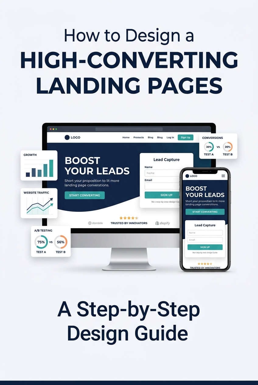
A well-designed landing page can turn casual visitors into customers, email subscribers, or qualified leads. Whether you are promoting a digital product, selling a service, or building an email list, the way you present your offer can influence whether visitors take action or leave without engaging.
However, creating a high-converting landing page involves more than choosing an attractive template. You need a clear message, a relevant offer, persuasive copy, a simple layout, and a smooth user experience. Visitors should understand what you offer, how it benefits them, and what they need to do next.
The good news is that you can build an effective landing page without advanced coding skills or a large budget. The key is to start with your audience’s needs, remove unnecessary distractions, and improve the page using real performance data.
This guide explains how to design a landing page from scratch, write compelling content, choose the right layout, improve conversions, and fix common problems that prevent visitors from taking action.
A landing page is a web page designed around a specific marketing goal. That goal might be selling a product, collecting email addresses, generating leads, promoting a free download, or encouraging visitors to book a consultation.
Unlike a homepage, which usually introduces a business and provides several navigation options, a landing page focuses on one primary offer. This makes it easier to guide visitors toward a particular action.
For example, a business offering an SEO checklist could create a landing page that explains what the checklist includes, describes how it helps website owners, and provides a simple form to access it.
The page does not need to explain every service the business offers. It only needs to provide enough information for the visitor to understand the resource and decide whether it is useful.
Landing page design matters because confusing messages, slow loading times, complicated forms, and unclear calls to action can create unnecessary obstacles. Even a valuable offer may struggle to generate conversions when visitors cannot understand its benefits quickly.
An effective landing page combines relevant messaging, clear design, useful information, and a straightforward conversion process.
How to Design a High-Converting Landing Page Step by Step
Building a landing page becomes easier when you approach it as a series of practical decisions. Before working on colors and layouts, establish your goal, understand your audience, and decide what information visitors need to make a confident decision.
1. Define Your Landing Page Goal
Start by deciding what you want visitors to do. This goal will influence the headline, content, form, CTA button, and conversion tracking.
For example, an email marketing campaign might aim to collect newsletter subscriptions, while a software company might encourage visitors to start a free trial. A service provider may want qualified prospects to request a quote.
Choose one primary conversion goal instead of promoting several unrelated actions on the same page. Too many competing options can distract visitors and make the next step less obvious.
Your goal should also be measurable. A completed purchase, successful signup, or submitted consultation request provides a clearer measure of success than a simple button click.
Once you know the desired outcome, evaluate every major element against that goal. If a section does not help visitors understand the offer, evaluate its value, or take the next step, consider simplifying or removing it.
2. Research Your Target Audience
A landing page is more persuasive when it addresses a problem visitors actually want to solve.
Think about your audience’s goals, frustrations, questions, and concerns. Someone searching for beginner-friendly SEO software may value simplicity and affordability, while an experienced marketer may prioritize reporting, integrations, and automation.
Customer reviews, support questions, surveys, and conversations with existing customers can help you understand these differences.
Pay particular attention to the objections that prevent people from taking action. Visitors may worry about pricing, product compatibility, cancellation terms, delivery, or the reliability of the business.
Address these concerns in the page content wherever appropriate. When visitors can find relevant answers without searching elsewhere, they have a clearer basis for making a decision.
Use familiar language that reflects how your audience describes its problems. Clear, specific wording is usually more useful than technical jargon or broad marketing claims.
3. Create a Strong Value Proposition
Your value proposition explains what you offer, who it helps, and why it is worth considering.
Place the main message near the top of the landing page. Visitors should not need to read several paragraphs before discovering what the offer does.
For example, a headline such as “Transform Your Digital Future” sounds broad but provides little practical information. A headline like “Organize Your Projects Without the Spreadsheet Chaos” communicates a more recognizable problem.
Support the headline with a short explanation of the offer and its main benefit. If you are promoting project management software, explain how it helps users manage tasks, deadlines, and team updates in one place.
Your value proposition should be specific without making promises you cannot support. Avoid exaggerated claims about guaranteed results, instant success, or dramatic improvements.
The goal is to help visitors understand the offer quickly and decide whether it matches their needs.
4. Plan a Clear Landing Page Layout
Once your message is ready, organize the page so visitors can move naturally from understanding the offer to taking action.
A simple wireframe can help you plan the order of headings, text, buttons, forms, and supporting information before building the actual page.
Start with a hero section containing the main headline, supporting text, and primary call to action. Depending on the offer, you may also include a product screenshot or a short form.
Next, explain the main benefits and show visitors what they will receive. For a software product, this could mean describing important features and how they solve everyday problems. For a service business, it might involve explaining the process, expected deliverables, and what happens after a customer makes contact.
Add relevant trust signals, such as genuine customer feedback, verified reviews, or examples of previous work. Finish with answers to important questions and another opportunity to complete the primary action.
Not every landing page needs every section. A simple signup page can be short, while a complex service offering may require more detailed explanations. Include enough information to support the visitor’s decision without adding unnecessary content.
5. Write Persuasive Landing Page Copy
Landing page copy should explain the offer in a natural, direct, and useful way. Focus on what visitors want to accomplish rather than describing your business in general terms.
Use a benefit-focused headline, short supporting paragraphs, and descriptive subheadings. Keep the language familiar and remove sentences that repeat information without adding value.
It is also important to distinguish features from benefits. A feature describes what a product does, while a benefit explains why that capability matters to the user.
For example, automated email sequences are a feature of an email marketing platform. Spending less time sending repetitive messages is a potential benefit.
Your copy should also explain important conditions. If the offer involves a subscription, clarify recurring costs and relevant cancellation terms. If you are offering a free resource, explain what visitors receive and how they can access it.
The right amount of copy depends on the complexity of the offer. A simple download may need only a brief explanation, while an expensive service may require detailed information, examples, and answers to common objections.
How to Improve Landing Page Design and User Experience
Once the message and structure are in place, focus on making the page easy to read, navigate, and use. Good design helps visitors find important information without competing with the content itself.
6. Use a Clean Design and Clear Visual Hierarchy
Choose a consistent color palette, readable fonts, and enough spacing to separate different sections. Use headings and text formatting to show visitors which information matters most.
Your primary call-to-action button should stand out from surrounding content. A contrasting color can help, provided the button remains readable and fits the overall design.
Avoid filling the page with unnecessary animations, decorative graphics, or competing colors. These elements can distract visitors from the main offer.
Use visuals only when they help explain a product, demonstrate a process, or provide useful context. For example, a screenshot may help visitors understand software functionality better than a generic stock image.
Keep navigation focused as well. Removing unnecessary links can help visitors concentrate on a campaign, but useful information about pricing, privacy, or the business should remain accessible when needed.
7. Make the Call to Action Easy to Understand
The call to action, or CTA, tells visitors what to do next. Its wording should clearly describe the action they are about to take.
Labels such as “Download the Free Guide,” “Start My Free Trial,” and “Book a Consultation” set clearer expectations than a generic “Submit” button.
Place the primary CTA where visitors can find it easily, including near the top of the page. On longer landing pages, repeating the same action near relevant sections can make conversion more convenient.
Avoid introducing several unrelated buttons with equal visual importance. Secondary links are appropriate when they help visitors evaluate the offer, but the primary action should remain clear.
Also, make sure the button works correctly. If a CTA leads to the wrong page, opens a broken form, or provides no feedback after being clicked, visitors may abandon the process.
8. Simplify Your Lead Generation Form
If your landing page collects leads, keep the form as short as practical. Every additional field creates another task for visitors, so request only the information needed for the next step.
A newsletter signup might require just an email address. A consultation form may need a name, business email, and a short description of the visitor’s requirements.
Use clear field labels rather than relying only on placeholder text. Explain required fields, provide useful error messages, and preserve correctly entered information when validation fails.
After a successful submission, show a confirmation message or redirect visitors to a suitable thank-you page. Explain what happens next so visitors know whether to expect an email, a phone call, or immediate access to a resource.
These small improvements make the form easier to complete and help prevent confusion during the conversion process.
9. Optimize Your Landing Page for Mobile Devices
A landing page should work properly on smartphones, tablets, and desktop computers. A layout that looks good on a large monitor may become difficult to read or navigate on a smaller screen.
Use a responsive layout that adjusts to different screen sizes. Make sure headings wrap naturally, body text remains readable, and buttons are comfortable to tap.
Test the entire conversion process on a phone, not just the appearance of the first screen. Complete the form, click the CTA, and check that confirmation messages display correctly.
If a form is difficult to complete on mobile, reduce unnecessary fields and make sure the appropriate keyboard appears for each input. For example, an email field should support convenient email entry.
Avoid pop-ups that cover the main content or are difficult to dismiss. Mobile visitors need to access the offer without fighting the interface.
10. Improve Page Speed and Technical Performance
Slow loading can interrupt the visitor experience before someone has a chance to evaluate your offer.
Start by compressing large images, removing unnecessary scripts, and limiting plugins that provide little practical value. Choose reliable hosting and avoid adding multiple tracking tools without considering their effect on performance.
Pay attention to Google’s Core Web Vitals: Largest Contentful Paint (LCP), Interaction to Next Paint (INP), and Cumulative Layout Shift (CLS). Recommended targets for a good user experience are an LCP of 2.5 seconds or less, an INP of 200 milliseconds or less, and a CLS score of 0.1 or less.
You can use PageSpeed Insights to identify potential problems and prioritize improvements.
If a page loads slowly after installing a new plugin, compare its performance before and after the change. This helps identify whether the additional functionality is contributing to the problem.
Likewise, if the page shifts while loading, check whether images or embedded elements have defined dimensions. Reserving the necessary space can reduce unexpected movement and make the page easier to use.
How to Build Trust and Optimize a Landing Page for SEO
A landing page must do more than attract attention. Visitors need credible information to evaluate the offer, while search engines need clear content and technical access to understand the page.
11. Add Trust Signals That Support Your Claims
Visitors may hesitate because they are unfamiliar with your business or uncertain about the quality of your offer.
Genuine customer testimonials, relevant case studies, verified reviews, professional credentials, and examples of previous work can help address these concerns.
Choose proof that is relevant to the decision. For example, a service provider might explain how a project was completed, while a software company could show how a particular feature solves a practical problem.
Make pricing, privacy information, and relevant policies easy to find. Avoid fake testimonials, unsupported guarantees, misleading scarcity messages, and hidden costs.
Trust also depends on consistency. If an advertisement promises a free resource, visitors should be able to identify that resource immediately after arriving on the landing page.
12. Optimize Your Landing Page for Search Engines
SEO is useful when you want your landing page to attract visitors from Google, Bing, and other search engines. However, not every landing page needs to target organic search traffic. Some are designed specifically for paid advertising or email campaigns.
If organic traffic is part of your strategy, start by identifying the search intent behind your target keyword.
Use a descriptive SEO title, a readable URL, a clear main heading, and supporting headings that explain the content. Include relevant terms naturally, but do not repeat keywords just to increase their frequency.
For example, a page targeting “high-converting landing page design” should explain the design process, discuss important conversion elements, and help readers understand how to improve their pages.
Make sure search engines can access the page if you want it indexed. Check for accidental noindex settings, blocked resources, broken links, and mobile usability issues.
Most importantly, provide information that fulfills the promise made in the search result. Helpful content and a relevant user experience should guide your SEO decisions.
How to Measure and Improve Landing Page Conversions
Once your page is live, use analytics to understand how visitors interact with it. Measuring completed actions helps you determine whether your design supports your actual business goals.
13. Track Conversion Rate and Visitor Behavior
Your conversion rate is the percentage of visitors who complete the action you want them to take.
Calculate it by dividing the number of conversions by the number of visitors and multiplying the result by 100.
For example, if 1,000 visitors generate 40 completed signups, the conversion rate is 4%.
Track meaningful outcomes, such as completed purchases, successful form submissions, or booked appointments. Button clicks can be useful supporting metrics, but they should not be confused with completed conversions.
You can also measure form starts, CTA clicks, and visits to important sections. These events may help you identify where visitors encounter problems.
If many people click a CTA but few complete the form, examine the form length, instructions, technical errors, and privacy concerns. If visitors leave without engaging, review whether the headline matches their expectations and whether the main offer is immediately clear.
Also consider lead quality. A page that attracts fewer but better-qualified prospects may be more valuable than one that generates many irrelevant inquiries.
14. Test Changes Instead of Guessing
Landing page optimization works best when you make changes based on evidence rather than personal preference.
A/B testing allows you to compare two versions of an element, such as a headline, CTA label, or form. Keep the primary goal consistent and allow enough traffic to collect meaningful results.
For example, you might compare a headline that describes a product feature with one that emphasizes the benefit to the customer. Measure completed conversions to determine which version performs better.
Avoid changing many major elements simultaneously because it becomes harder to identify what influenced the outcome.
Before testing small design details, fix obvious problems such as broken buttons, confusing copy, slow loading, and forms that fail to submit. These issues create barriers that cosmetic changes cannot solve.
There is no single conversion rate that guarantees success across every industry. Compare results with your own baseline and relevant benchmarks, taking traffic quality and offer type into account.
Common Landing Page Mistakes to Avoid
Several common mistakes can prevent an otherwise useful landing page from generating results.
One is using a vague headline that fails to explain the offer. Visitors should not have to guess what the product does or why it matters.
Another is adding too many competing calls to action. Keep the primary goal clear and use secondary links only when they help visitors make a decision.
Complicated forms, unsupported marketing claims, and hidden costs can also reduce trust. Ask for only the information you need and explain important conditions before visitors commit.
Technical problems deserve equal attention. Broken buttons, slow loading, poor mobile layouts, and inaccurate conversion tracking can undermine the entire page.
Finally, avoid making design changes based solely on personal taste. Use customer feedback, analytics, and structured testing to identify what needs improvement.
Landing Page Launch Checklist
Before publishing your page, review the complete visitor journey. Confirm that the headline explains the offer, the main CTA is easy to find, and the content answers important questions.
Test the page on mobile and desktop devices. Submit every form, follow the buttons, check confirmation messages, and verify that analytics records successful conversions.
Review the loading speed, check for broken links, and ensure that pricing, privacy information, and other relevant conditions are easy to find.
Once these checks are complete, publish the page and monitor its performance. Treat the initial version as a starting point that can improve as you learn more about your audience.
Conclusion
Designing a high-converting landing page from scratch starts with a clear goal and a useful offer. Understand your audience, communicate the main benefit, organize the content logically, and make the primary action easy to complete.
Then focus on the details that support the visitor experience. Use readable copy, relevant trust signals, simple forms, responsive design, and reliable page performance. If organic traffic matters, make the page accessible to search engines and ensure its content matches the intended search query.
After publishing, measure completed conversions and investigate where visitors encounter difficulties. Fix technical problems first, then test focused improvements to the headline, CTA, form, and supporting content.
You do not need an elaborate design to get started. Build a clear, functional landing page, test the complete user journey, and use real performance data to make it better over time.